Sunday, October 30, 2011

By Terry Lumiere Veloutee in 3 beige naturel Review, Swatches

 *So sorry for the long long period of time in which I haven't been posting! I've been so busy lately. Thanks for understanding :)

**Unfortunately I've also put off this review so long that it might have been discontinued by now. I know that sounds bad, but it might still be for sale in spacenk stores and in Europe.

By Terry Lumiere Veloutee - I had my eye on this one for a while since it had been recommended as an excellent high end satin-matte medium coverage foundation. I did hesitate at the price initially, but I'm all about having beautiful looking skin.

Some background: My skin is in fairly good shape, though I have some discoloration and minor acne I'd like to cover. I like my foundations to be at least somewhat matte and have medium coverage. My beef with the foundations I've tried so far is fading around the nose and inability to blend seamlessly to make my skin look "perfect".

Skin type: I have combo skin in the summertime and dry-normal combo skin in the winter time. So far I've only been testing this foundation out now that my skin is a bit drier since I didn't buy this until it the end of fall. This foundation does list alcohol in the ingredients list and may not be the best for you if you have very dry and flakey skin. In fact, I didn't like it at first because I thought that it emphasized flakes; however, that problem minimized once I switched to a richer moisturizer and changed my skin care (I had been having the same problem with many other foundations).


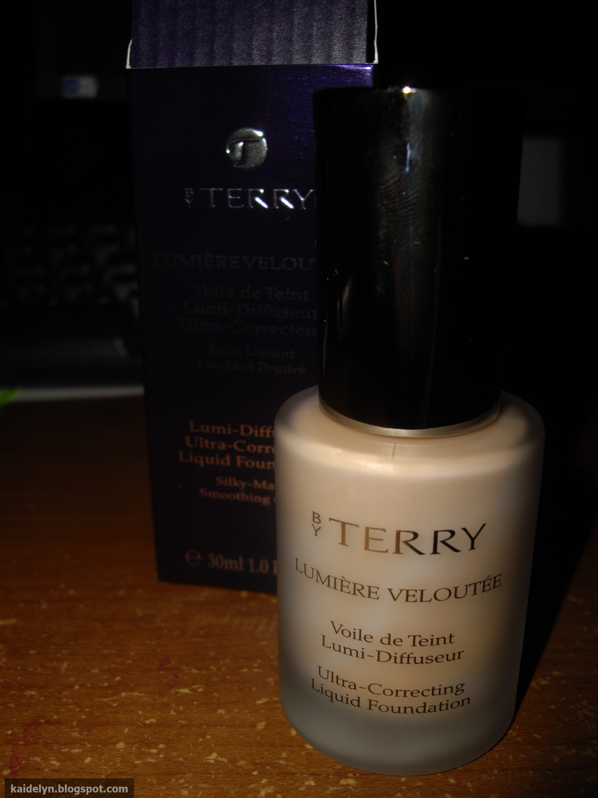
The packaging is great, as with all bT products; the foundation comes in a frosted glass bottle and a sleek pump. The color in the bottle does look marbled and stays that way even after shaking, but the foundation comes out in one solid color when pumped out.


The foundation is on the liquidy/runny side, less so than, say, MAC F&B though, since it is medium coverage.


Blended out; it looks too light for the back of my hand here but my face has actually gotten a tad paler than this now that it's been winter for a few months now.


Up close, you can see the satin finish; there are no shimmer particles or sparkles in it though. It just gives a subtle sheen for a nice satin finish on the skin.

I was going to do a pic of it applied on my face but I decided not to put off this review any longer. My skin's also not been too good to me lately, so I don't think I'd take a nice picture anyway.

I really like this foundation - it's definitely among the top three best that I've tried, but it's not holy grail for me. Although it covers decently well, my skin didn't look as perfect as I had wanted to. Beige naturel is a tiny bit too dark for me now but still wearable. The coverage can be built to medium-full but it didn't completely cover discoloration on my nose. The finish is definitely very nice - polished yet somewhat natural. Lasting power varies - sometimes when I don't powder, it can still look gorgeous after a couple hours; sometimes, though, it ends up fading a bit.

Overall, it's an excellent foundation, just not 'the one'.

Thursday, October 20, 2011

Lunasol Three-Dimensional Eyes Palette in 05 Deep Beige Review, Swatches

Today I bring you a Lunasol quad/palette from their fall 2011 collection. The Three Dimensional Eyes Palettes are arranged in the form of a quad, except two of the shades each have three different (albeit similar) colors in vertical stripes.

I bought one palette based off pictures I saw online, 05 Deep Beige. I was a bit surprised, when I saw it in real life, that the shades lean a tinge gold/green. I had expected colors that were neutral-cool brown, but the colors are gorgeous nonetheless, and I am very pleased with this quad.

Before moving on to the pictures, I just want to mention that the texture of these eyeshadows is phenomenal. Each one of the shades is buttery smooth and lovely! Pigmentation is great, but could be improved.

All pictures were taken indoors with artifical lighting and flash. I know, I should have done natural lighting but I've been super busy lately and don't have time to wait for the sun to come out. Nonetheless, enjoy!

 I'm such a dork, but - I love that the boxes were wrapped in cellophane. I understand that high end brands in the US usually don't have a problem with someone opening the merchandise and rubbing their grubby fingers in it, but it happens, so the cellophane is a nice touch.

Packaging gets an A+++!


Yep, comes with sponge tip applicators and a little brush. I'll most likely never touch them but the brush isn't too bad - decently soft and usable in a pinch.

I honestly haven't used this palette enough yet to tell you if the colors vary in different lighting but you can totally see in the pictures below that it can show up leaning either cool or warm (which would also make sense, given its name ;)).


The top left shade includes a shimmery white gold, a satin off-white with a slight yellow tinge, and another satin off-white that is the slightest bit less yellow than the middle shade.

The next one is a shimmery, wearable pale gold with gold sparkles and a bit of white sheen.

The third color is the most interesting in my opinion - a warm taupe color with a cool tinge due to silver, green, and purple microsparkles.

 Last but not least - another mini-trio of colors including an almost-but-not-quite-matte cool dark brown, a dark slightly bronzey-olive brown, and a more olive dark brown with more sparkles than the other shades.

I've included a heck load of swatch pics so that you can hopefully see the subtle color shifts :)

 This picture features the shades in the top left rectangle: left, middle, right, and then swatched together.

 First four swatches in the same order as above, then top right, bottom left.

 rightmost swatch is of the bottom left color, then the bottom right swatched separately and then together.

 bottom right shades


I bought this from adambeauty.com for around $60 and it comes with 4g eyeshadow.

 Phew! Now that we got through that, hope you enjoyed the mini-review & pics. :)

-k


Friday, October 7, 2011

Guerlain Ecrin 4 Couleurs Eye Shadow Palette in 05 Les Gris Review

This post concludes my mini-series on the Guerlain quads released this fall 2011, and I'm here with the last set of pictures for 05 Les Gris. Les Gris has, in my opinion, one of the most gorgeous color combinations amongst the  new autumn quads with a dark smokey blueish-gray (matte) on the left, a satin midtoned teal with gold shimmers on the middle bottom, a sheer pale gray (sheen) on the middle top, and a vibrant silver with blue sparkles (shimmer/frost) on the right.

Since this post is more of a color description/swatch post, you can read my thoughts on the quality of the Guerlain Ecrin 4 Couleurs Eye Shadow Palettes here.


 from left to right: left, middle bottom, middle top, right

 same order as above, swatched more heavily

Monday, October 3, 2011

Guerlain Ecrin 4 Couleurs Eye Shadow Palette in 04 Les Bois de Rose Review

Today I'm here with my second set of pictures of the Guerlain Ecrin 4 Couleurs Eye Shadow Palettes, this time featuring Les Bois de Rose. This post will be more of just a description and swatches of the colors. If you are interested in my opinion of the Ecrin 4 Couleurs palettes in general, check out this post.

 Les Bois de Rose features a shimmery dark brown-purple on the left, a satin soft warm rose pink with sparkles on the middle bottom, a shimmery light white-pink with a frosty finish on the middle top, and a satin brownish purple taupe on the right.

With these swatches I took pictures in natural light as well as just flash (which I should really start doing for all my swatches) because I feel they have more of a tendency to show up differently in natural vs. artificial light, more so than Les Fumes or Les Gris.


swatches under natural light: left, middle bottom, middle top, right

same swatches as above, under soft flash

flash, swatched a bit more heavily

This quad is great for making a soft, feminine eye look since the pink is a subtle one and the palette is pink/purple but also leaning neutral. I'm in love with the brown-purple taupey shades on the sides, and the lightest shade makes a very pretty inner-corner highlight.

Monday was tiring! My pictures on Les Gris will be coming up very soon. Have a wonderful rest-of-the-week. :)

Saturday, October 1, 2011

Guerlain Ecrin 4 Couleurs Eye Shadow Palette in 06 Les Fumes Review

So sorry I've been MIA lately; real life has been stressful :) But I'm back with swatches and reviews of three of the palettes released in Guerlain fall. I'm starting off with Les Fumes, a quad of gray, taupe, and pewtery goodness. This one has been a favorite in the beauty blogging world for obvious reasons.

I think the main selling point of Guerlain eyeshadows is their aesthetics; the gold casing is very beautiful (albeit difficult to photograph, which is why I decided to leave out a picture of its cover) yet doesn't look tacky at all. The casing is fairly heavy for a quad and includes a large mirror, in addition to a double ended sponge tipped applicator.

That being said, I think the quality of these eyeshadows are great, but not as good as they could be. They're certainly better than drugstore eyeshadows. Compared with mid-end eyeshadows such as Inglot or MAC, they're comparable if not slightly subpar in pigmentation but better texture-wise (which translates to: easier to blend & work with). Compared to luxury high quality eyeshadows they are comparable in pigmentation but subpar when it comes to texture. The eyeshadows are still soft to the touch, don't get me wrong, but not as soft as Hourglass's (which can sometimes be a bit too soft) and don't have that "bounce" of LMdB eyeshadows. I feel that Guerlain could make up for it with a big more pigmentation, but they're still great - I suppose I'd give them a grade of B+ to A-.

I did check out a few of Guerlain's other eyeshadows and while Guerlain's eyeshadows can be quite hit-or-miss, these quads are on the better end of the range. I'm glad to see that quality among the new quads is more consistent, and Les Fumes is no exception. Les Fumes includes an ashy beige-gray (satin with tiny sparkles) on the left, a darker cool charcoal gray-taupe (satin-matte) on the middle bottom, a mauvey rose (matte) on the middle top, and a light taupey silver (shimmer) on the right side.


Les Fumes, swatched - swatches built up with a few swipes
left to right: left, middle bottom, middle top, right

Les Fumes swatched more heavily, same order as above

As shown in the pictures above, you may need a few passes if you really want to build up an opaque color but overall this is a very nice quad suitable for both work in the daytime or a night out. Les Fumes is a great quad; I would personally give it my seal of approval and recommend it to anyone :)

-k